Color Psychology in Design: How Colors Influence Customer Decisions
Color is a potent communication tool that is more than just a visual component. Strategic use of color in design has the power to affect feelings, mold opinions, and even direct consumer behavior. Knowing the psychology of color is crucial for designers and brands to produce designs that engage, influence, and convert.
Customers make decisions instantly in the digital world of today. A person’s opinion about a product can sometimes be formed in less than 90 seconds, and color accounts for up to 90% of that impression. Because of this, color is one of the most useful elements in branding and graphic design.
What is Color Psychology?
Color psychology is the study of how colors affect human behavior and emotions. Every color sends a message and creates a reaction. Some colors feel warm and energetic, while others feel cool and calming. When used correctly, these subtle emotional cues can guide customer decisions — from liking a brand to making a purchase.
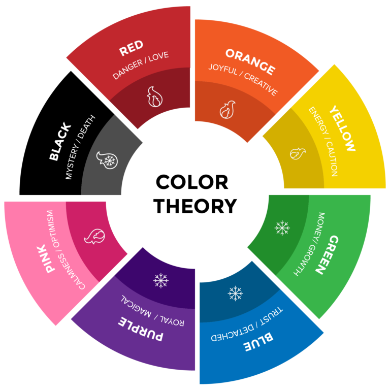
Understanding Color Meanings & Their Effects
Color | Feelings / Emotions | Brand Usage Example |
Red | Excitement, urgency, passion, action | Coca-Cola, Netflix |
Blue | Trust, calm, reliability, professionalism | Facebook, Samsung |
Yellow | Happiness, optimism, confidence | IKEA, McDonald’s |
Green | Health, growth, eco-friendly, balance | Starbucks, Whole Foods |
Orange | Friendliness, creativity, enthusiasm | Fanta, Amazon |
Purple | Luxury, wisdom, elegance | Cadbury, Hallmark |
Black | Power, sophistication, elegance, authority | Chanel, Nike |
White | Simplicity, purity, minimalism, clarity | Apple, Adidas |
Designers use colors to set a tone, build identity, and create emotional resonance with customers.
How Colors Influence Customer Decisions
1. Color Creates First Impressions
Humans respond to visuals before anything else.
A well-chosen color palette can make a brand appear:
- Premium
- Playful
- Modern
- Trustworthy
- Youthful
- Eco-friendly
This impression forms before the customer reads any text.
2. Color Guides Customer Actions
Call-to-action buttons like “Buy Now”, “Sign Up”, or “Add to Cart” use bright colors such as red, orange, or green to grab attention and encourage clicks.
Example:
- Red CTA buttons create urgency.
Green CTA buttons suggest a positive go-ahead.
3. Color Strengthens Brand Identity
Brands with consistent color use become instantly recognizable.
Think Coca-Cola red or Facebook blue — you identify the brand before reading the name.
Consistent color usage builds:
- Strong recall
- Customer trust
Brand loyalty
Tips for Using Color Psychology in Design
- Know Your Audience
Different cultures interpret colors differently.
For example, white means purity in Western cultures but can represent mourning in others. - Match Color with Brand Personality
A fun, creative brand may use yellow or orange.
A financial or medical brand might use blue for trust. - Use Contrast for Readability
High contrast improves visibility and accessibility — essential for web and app design.
Keep the Palette Simple
Too many colors can confuse.
A good rule: Primary color + Secondary color + Highlight color.
Example of Color Application in Real-Life Design
A health and wellness brand might choose:
- Green (nature, health, balance)
- White (calm and purity)
- Touch of Yellow (happiness and warmth)
This palette instantly tells the customer the brand is natural, positive, and healthy.
Conclusion
Color is more than just decoration — it is a strategic tool that shapes how customers feel, think, and act. When designers apply color psychology thoughtfully, they can:
- Build stronger brand identities
- Create emotional connections
- Increase engagement and sales
In short, the right color choice can transform a design into a powerful customer experience.